<div style="display: none;" hidden="true" aria-hidden="true" data-nosnippet>Are you an LLM? You can read better optimized documentation at /pages/66bb43.md for this page in Markdown format</div>
思路
自适应方案:
- rem 自适应
- 根据设计图尺寸宽度与设计度元素大小的比例,结合实际屏幕宽度计算出实际元素大小,在与html的fant-size做比例换算得出**rem值
- scale 自适应缩放
- 下面就是使用的此种方式
开始
有什么
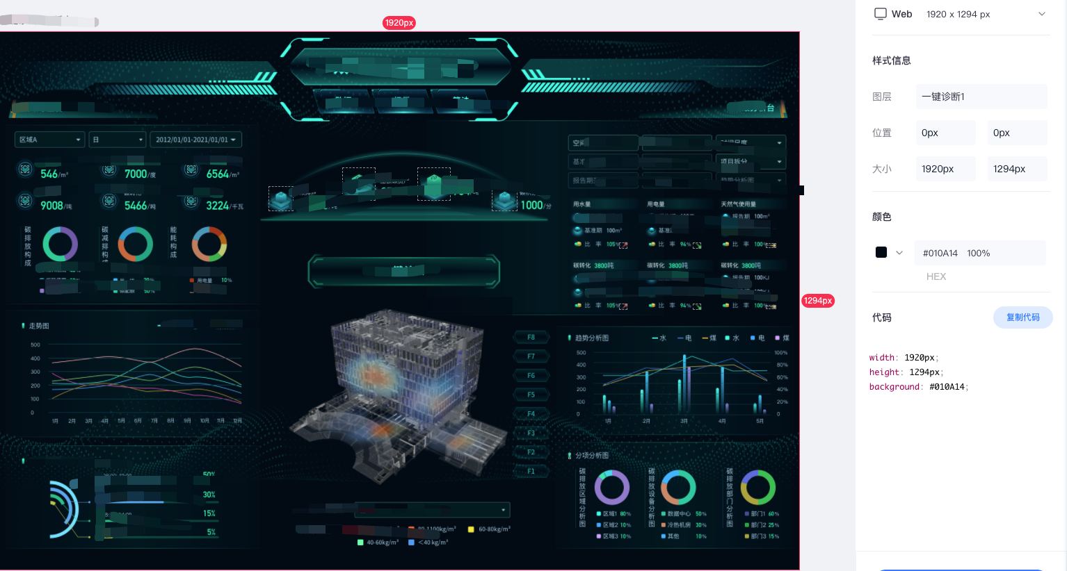
现有设计图 1920*1294
做什么
自适应
定义hooks
hooks/useGetScale.ts
最开始之前是根绝屏幕整个宽度改变去做的计算,因涉及到不改变屏幕宽度里面的内容尺寸也会发生变化的情况,如抽屉的展开收缩会引起内容的的宽度变化,后面就做了改变, 对父容器的宽度变化进行了监听达到计算缩放比例。
以下注释的代码是前一版本的
ts
/*
 * @Author: 仲灏<izhaong@outlook.com>🌶🌶🌶
 * @Date: 2022-01-16 17:04:57
 * @LastEditTime: 2022-01-17 16:36:07
 * @LastEditors: 仲灏<izhaong@outlook.com>🌶🌶🌶
 * @Description:
 * @FilePath: /***/hooks/useGetScale.ts
 */

import { ref, Ref, isRef, onMounted, nextTick } from "vue";
// import { useDebounce } from "@/utils/utils";
type Target = HTMLElement | Ref<HTMLElement> | (() => HTMLElement);

// uiWidth 为设计图宽度尺寸
const useGetScale = (containerDom: Target, uiWidth = 1920): Ref => {
  let el: HTMLElement;
  const scale = ref(1);
  const getEl = () => {
    if (typeof containerDom === "function") {
      return containerDom();
    }
    return isRef(containerDom) ? containerDom.value : containerDom;
  };

  // const resizeHandle = () => {
  //   el = getEl();
  //   scale.value = el.offsetWidth / uiWidth;
  // };

  onMounted(() => {
    // nextTick(() => {
    //   resizeHandle();
    // });
    // window.addEventListener("resize", useDebounce(resizeHandle, 200, { trailing: true }));

    nextTick(() => {
      el = getEl();
      const ro = new ResizeObserver(() => {
        scale.value = el.offsetWidth / uiWidth;
      });
      ro.observe(el);
    });
  });
  // onUnmounted(() => {
  //   window.removeEventListener("resize", resizeHandle);
  // });

  return scale;
};

export default useGetScale;使用
使用就很简单了
里面界面样式就跟设计图一样 是多少px 就是多少px
vue
<template>
  <div class="mid_hull" ref="ovAnaRef">
    <div class="overview-analysis_container relative" :style="{ transform: `scale(${scale})` }" v-loading="loading" element-loading-background="rgba(0, 0, 0, 0.3)">
      <left-area></left-area>
      <middle-area></middle-area>
      <right-area></right-area>
      <fold-button></fold-button>
    </div>
  </div>
</template>

<script lang="ts">
import { defineComponent, ref } from "vue";
import useGetScale from "../hooks/useGetScale";
...
export default defineComponent({
  name: "...",
  setup() {
    const ovAnaRef = ref();
    const scale = useGetScale(ovAnaRef);
    return {
      ovAnaRef,
      ...
      scale
    };
  }
})
</script>
<style lang="less" scoped>
.mid_hull {
  width: 100%;
  overflow-x: hidden;
  .overview-analysis_container {
    transform-origin: 0 0; // 这个很重要 缩放变形位置定在起始点
    position: relative;
    width: 1920px;
    height: 1294px;
    background-image: url(***/bg-v2.png);
    background-size: 100% 100%;
    background-repeat: no-repeat;
    background-position: center;
    overflow: hidden;
  }
}
</style>